Written by: Mark Anthony
Published: December 8, 2022
Last updated: June 30, 2026
The answer is simple...
…A serif is a decorative stroke that finishes off the end of a letters stem
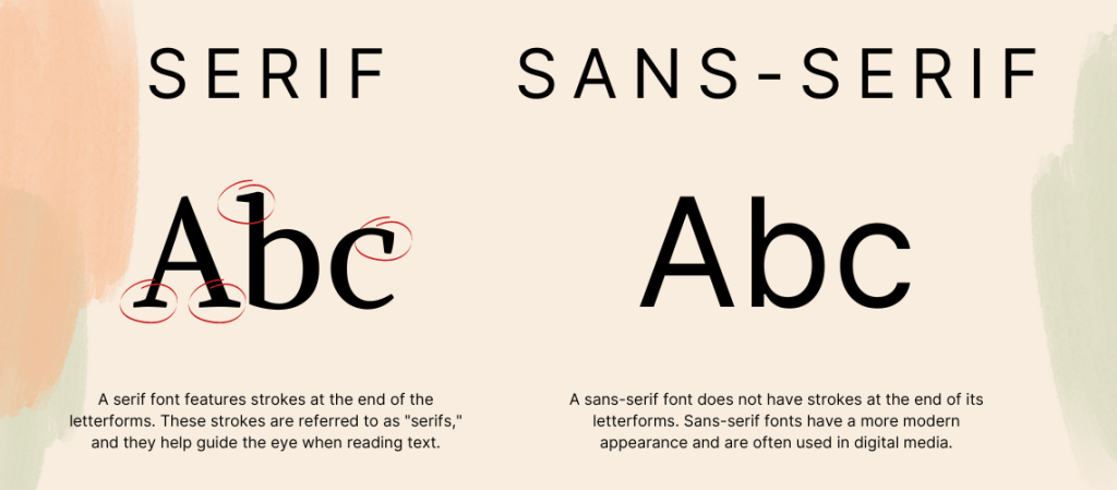

The clean, crisp lines of sans-serif fonts are the main reason many web designers prefer this style of font for on-screen use.
The clean lines and sharp edges are able to render out more clearly on a screen which increases legibility for users.
Fonts are similar to the clothes you wear, they provide people with a first impression of who you are.
That’s why you need to be intentional and strategic with the fonts you choose.
Choosing the wrong font can completely change the personality of your brand, thus giving people the wrong impression about your company.
That’s why it’s important to understand each style and choose a font that aligns with the message your brand wants to communicate.
Serif fonts have a history that dates back to the 18th century, when stonemasons carved letters into rock.
This makes them a good fit for companies that want to appear more reputable, established, and serious.
Professional businesses such as law practices, accountants, and insurance companies are all examples of companies for which a serif font would be a good choice.
Sans serif fonts take the opposite approach and embrace simplicity and the feeling of being modern.
Sans serif fonts give off a feeling of being casual, informal, friendly, and very approachable.
Companies that want their brands to appear more youthful and relatable tend to use sans serif fonts.